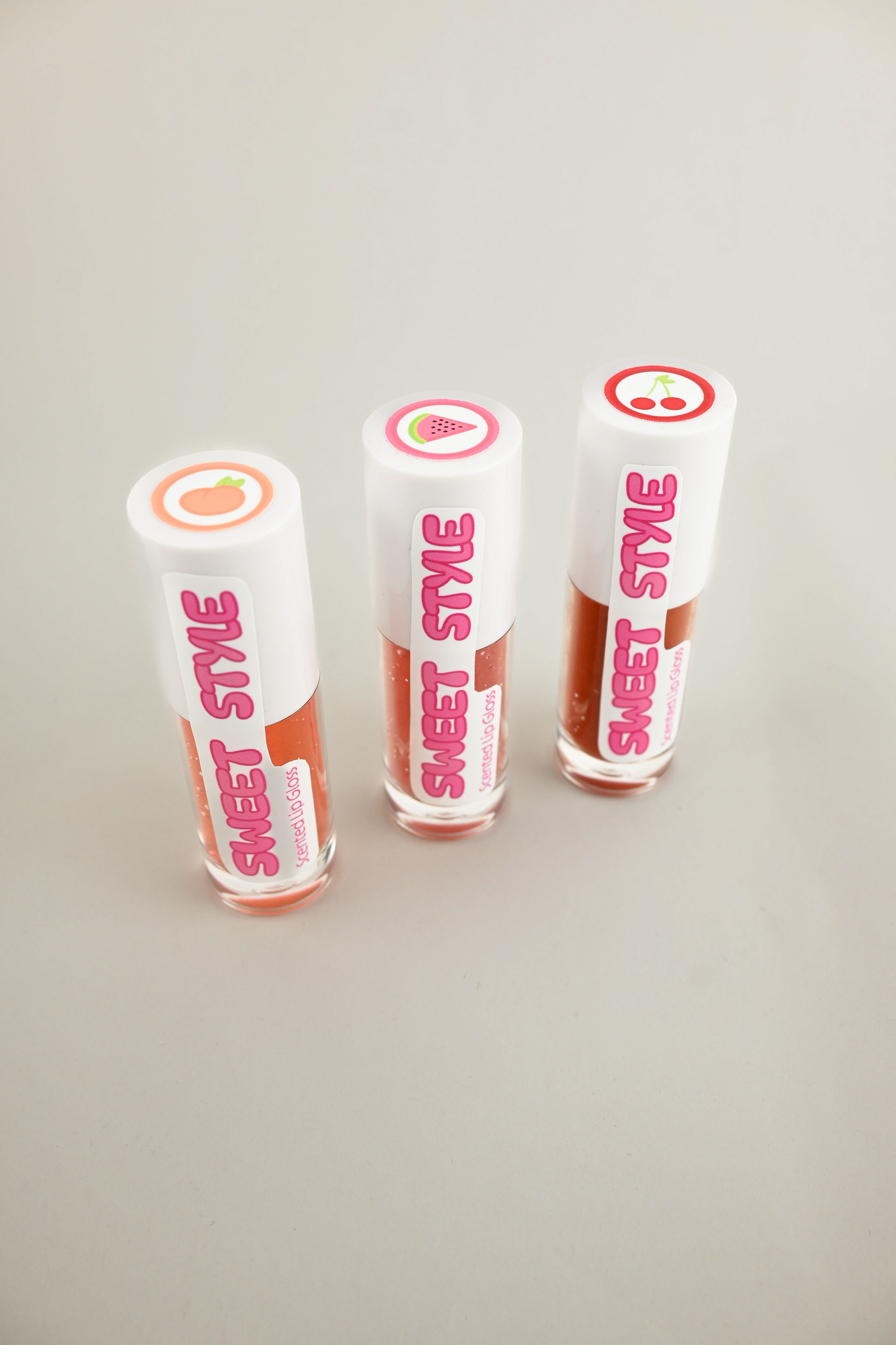
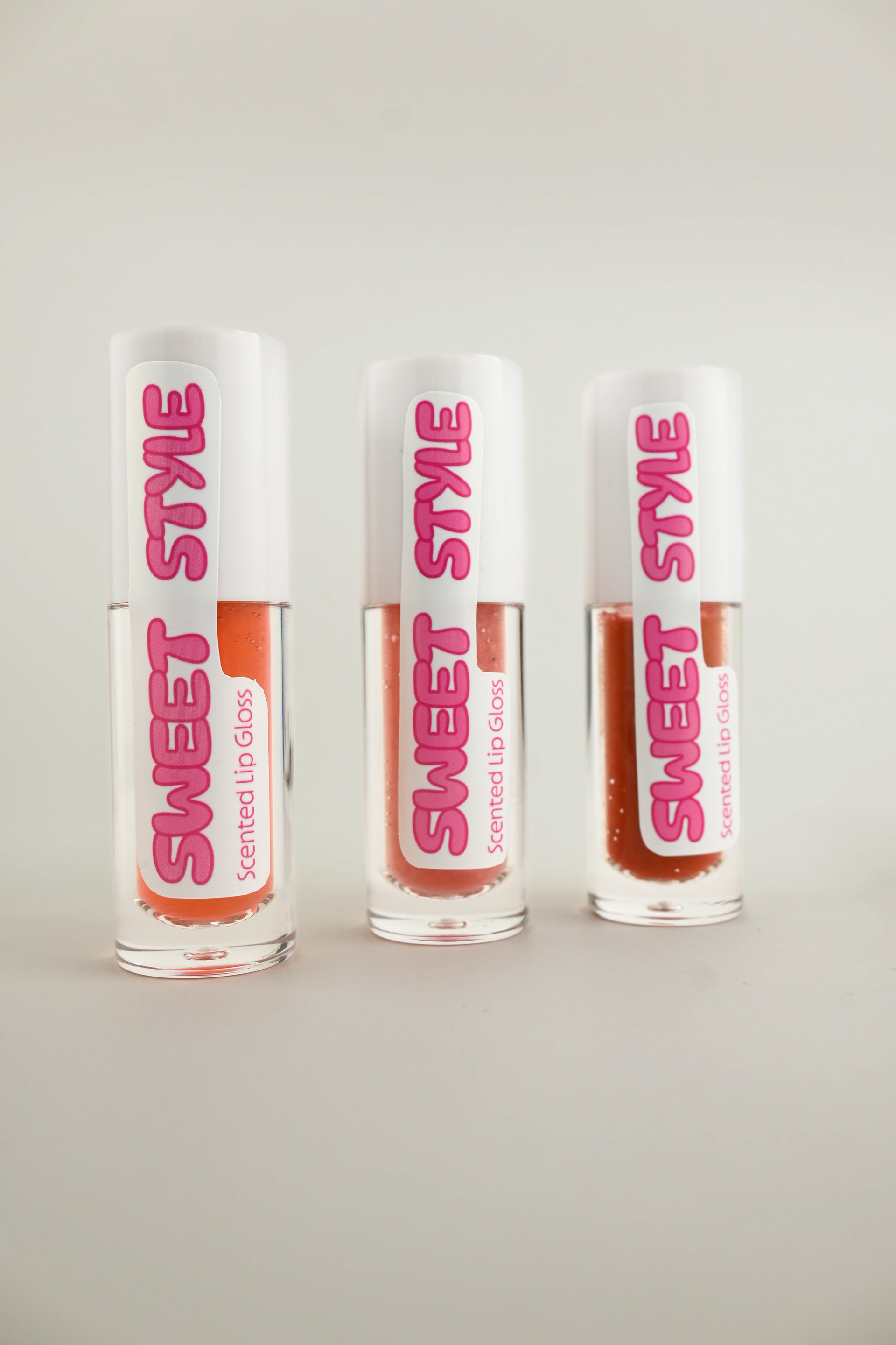
The project was to create a series of products with three variations, visually separated by the packaging design.
My first step was to determine my brand standards. This would inform my target audience and the tone and style my design would follow. After determining my branding and target audience, I researched the variations among cosmetic lines. I determined that colour and scent were the main product variations, and I decided to lean further into the scent aspect since colour variations are more expected. Lastly, I determined how I would achieve the product separation through my designs. I determined that Icons were more legible, better aligned with my brand, and would allow me to maintain a unique yet consistent brand design.
I started with the typography of the brand logo. The typography needed to be clear but still maintain character. I then illustrated my three scent icons. I determined the colours based on the fruit the scents mimicked and on what colour the lip gloss would theoretically take. I then printed the logo and scent Icons on sticker paper using Cricut and hand-cut them out. Lastly, I found a way to mimic the appearance of lip gloss using clear slime and food colouring and filled real lip gloss tubes with the concoction so that my final product photography would be as realistic and professional as possible.